The Internet is sometimes compared to the printing press developed by Johannes Gutenberg in the fifteenth century. These inventions shared in common the capacity to enable the production, dissemination and democratization of information, creating new platforms for mass communication.
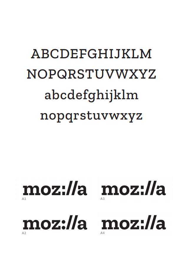
The invention of movable metal type was a key part of the successful application of Gutenberg’s press and the principles that governed the use of such type shaped much of how we think of digital typography. The language we use today still owes much to the language of those early printers and the companies that create today’s webfonts still think of themselves as foundries, even though they no longer cast metal type. One such foundry, Typotheque, pioneered the use of high-quality, commercial webfonts and it was them that Mozilla approached to develop a new, freely available, open-source font as part of the development of a new brand identity by design agency Johnson Banks.
The agency followed an open design process, sharing their development on a blog and inviting feedback. One of their early concepts drew on ideas around programming protocol and the visual influence of the font ‘Courier’. This non-proprietary, monospaced slab serif font was developed by IBM in the 1950s, becoming one of the most popular typewriter fonts of the time and later, with the development of computing, synonymous with code.
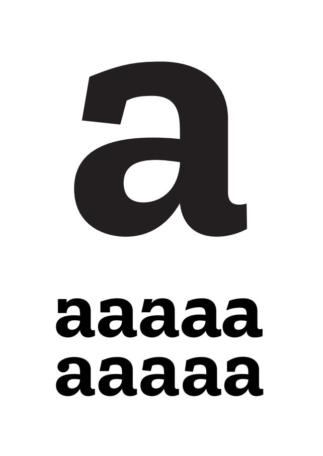
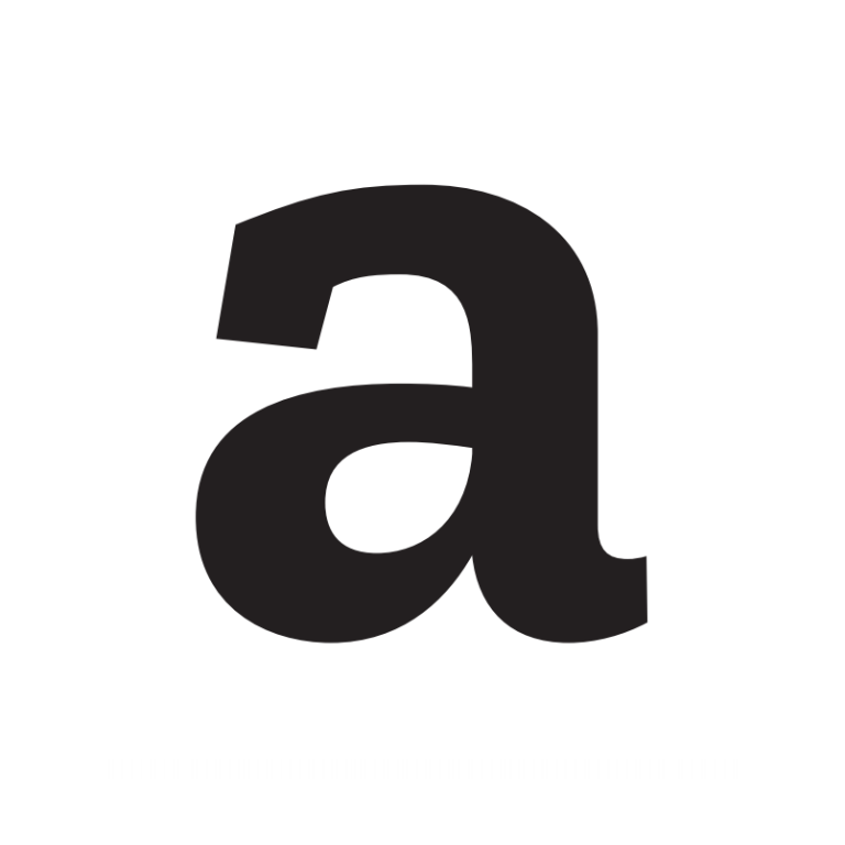
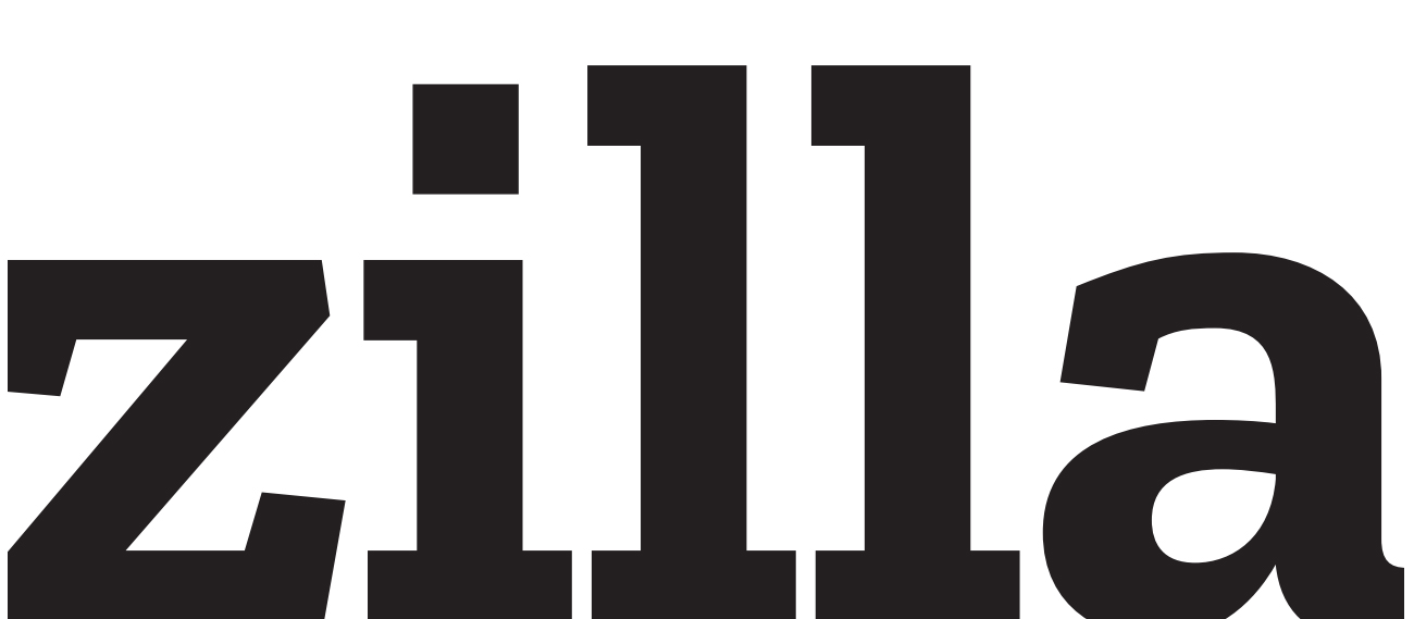
This route became the preferred option. Peter Biľak of Typotheque worked closely with Yuliya Gorlovetsky, Mozilla’s Associate Creative Director, to develop the new font in parallel with the development of the wordmark, exploring how changes to its design could impact on characters across the font. After thirty-five rounds of review, the design team had found a compromise, balancing the needs of the logotype with those of the font they affectionately called Zilla Slab. As Yuliya recalls: “It’s amazing how many people will ask if they can stop coming to meetings when you talk through 10 different ‘a’ options.” According to Peter, the exploration of the lowercase ‘a’ informed much of the development of the rest of the font:
“The lowercase ‘a’ is a more complex letter that provides clues to how other letters may look in a full exploration of the logotype. We wanted to bring an angled stroke to the top of the ‘a’, mimicking the slashes of the internet protocol. The other letters would then need to follow the same construction principles.”
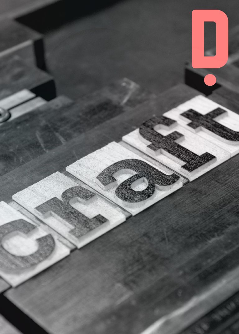
We wanted to explore how this, principally digital, font could be explored through analog craft, so we invited our friend, printmaker Thomas Mayo, to collaborate with us on a new print.
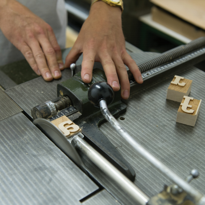
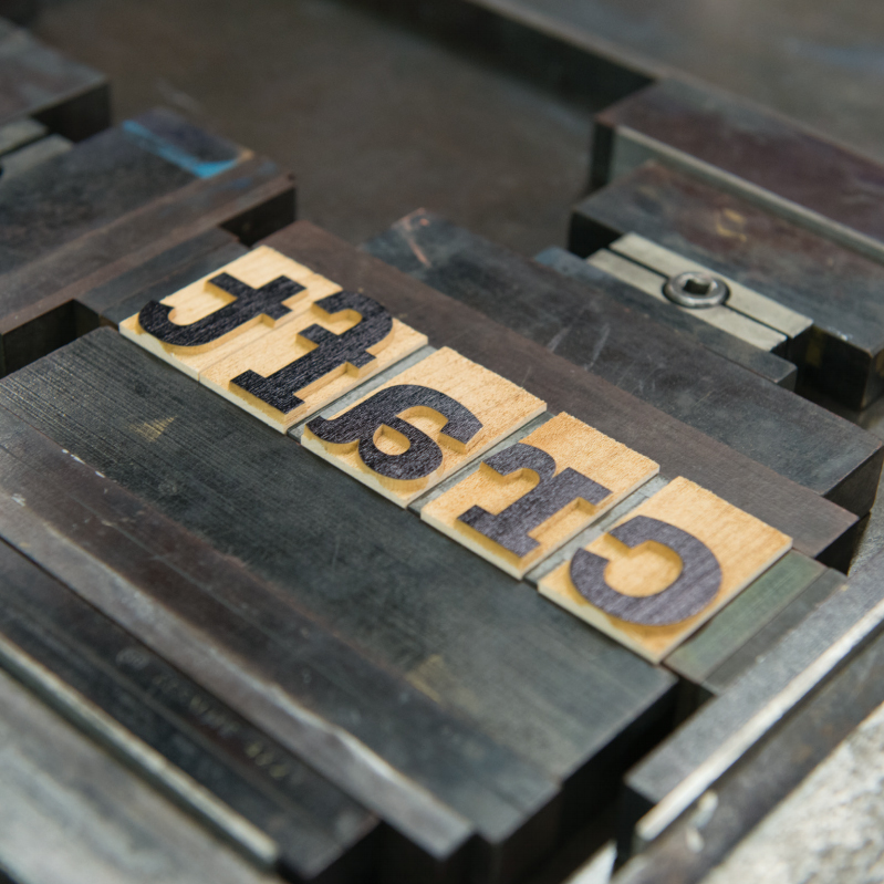
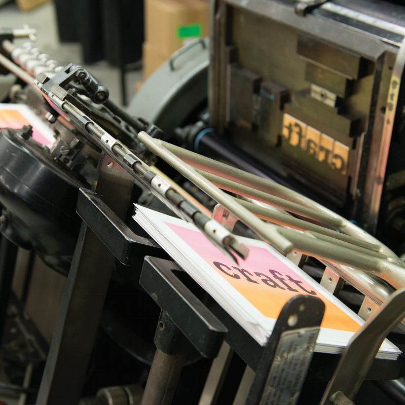
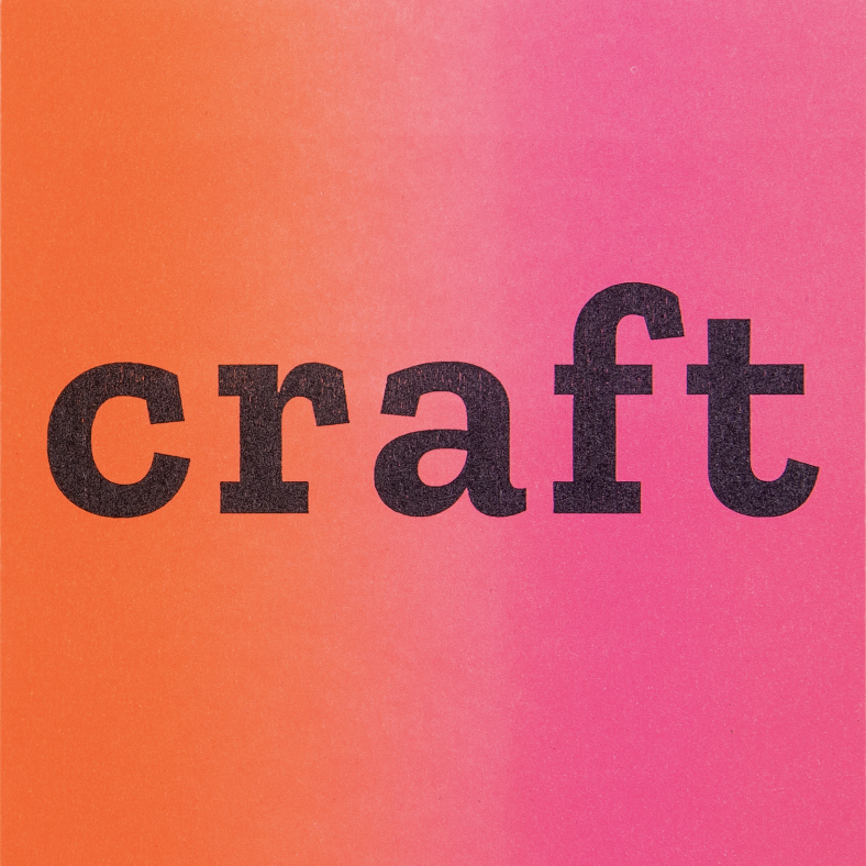 In between helping some of the UK’s leading designers to realize their ideas in letterpress, Thomas also produces his own beautiful prints and wooden printing blocks. For our print, Thomas created a bespoke set of wood type from the Zilla font; selecting pieces of side-grain maple from his workshop and laser engraving them before cutting and finishing them by hand. The type was then printed on a 1960’s Heidelberg platen press.
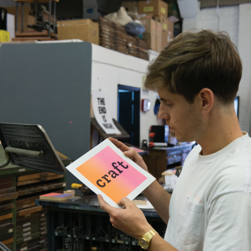
Now that we live in a society that consumes much of its type through screens, I asked him what he thought about advances in technology and whether the craft of Letterpress was still relevant.
“Letterpress is still important today, whether in teaching graphic design students about typesetting and typography or just reminding us that we can still use our hands to create prints. It’s much more orientated towards craft as the process of letterpress is used mostly on small batch print production but it’s a printing process that’s hard to match with any modern technique. New technologies such as laser cutting have actually been extremely helpful within the craft of letterpress. It’s enabled me to create my own movable wooden type and printing blocks, which makes the process a lot more accessible. It’s allowed me to take digital designs that were never intended to leave the computer screen and turn them into physical objects and then analogue prints.”